

Training Data
Flowchart Design at Vatico
This is a reflection on making flowcharts at Vatico — written after having done it wrong the first time. It covers the mistakes we made, the rules we learned, and the mindset shift that finally produced diagrams the team could actually use. If you have a flowchart ticket coming up, read this before you open draw.io.
Read Relevant Blogs First
When we first got a flowchart ticket, the instinct was to jump straight into the diagram. That was the wrong move. Before you draw a single arrow, you need to understand the business flow you are drawing. If you are diagramming something you do not yet understand, you are not documenting reality — you are documenting your assumptions. And assumptions in a Vatico diagram become misinformation that the whole team works from.
The first thing to do — always — is to read the blog posts relevant to the problem you are solving. Two of them will cover most of the business flows you will encounter here:
Recommended reading before any flowchart ticket:
• Order fulfillment workflows in Vatico
• Overall operational and data workflows for payment reconsolidation
Read them before you ask questions. Then ask questions about what you still don’t understand after reading.
After reading, your next step is to get the scope of your ticket crystal clear before you touch any tooling.
Scope the Problem Before You Draw Anything
Before touching draw.io, read the ticket literally — don’t default to your comfort zone. As data analysts, we initially assumed a flowchart request meant mapping out full data warehouse pipelines. But our supervisor needed the physical floor operations. Misinterpreting the lens cost us two days of rebuilding.
What you must do: Clarify the exact boundaries, target audience, and required depth before drawing. Knowing whether you are mapping physical goods or system data prevents wasted effort on out-of-scope logic.
What the ticket actually said vs what we built
Ticket: “Draw out the flow chart of how SO and PO works in warehouse. Layman flow for inbound and outbound at warehouse physical level. Secondary is how shipment gets updated (after primary is done first). Out of scope: DWH, warranty, returning SO and PO for now.”
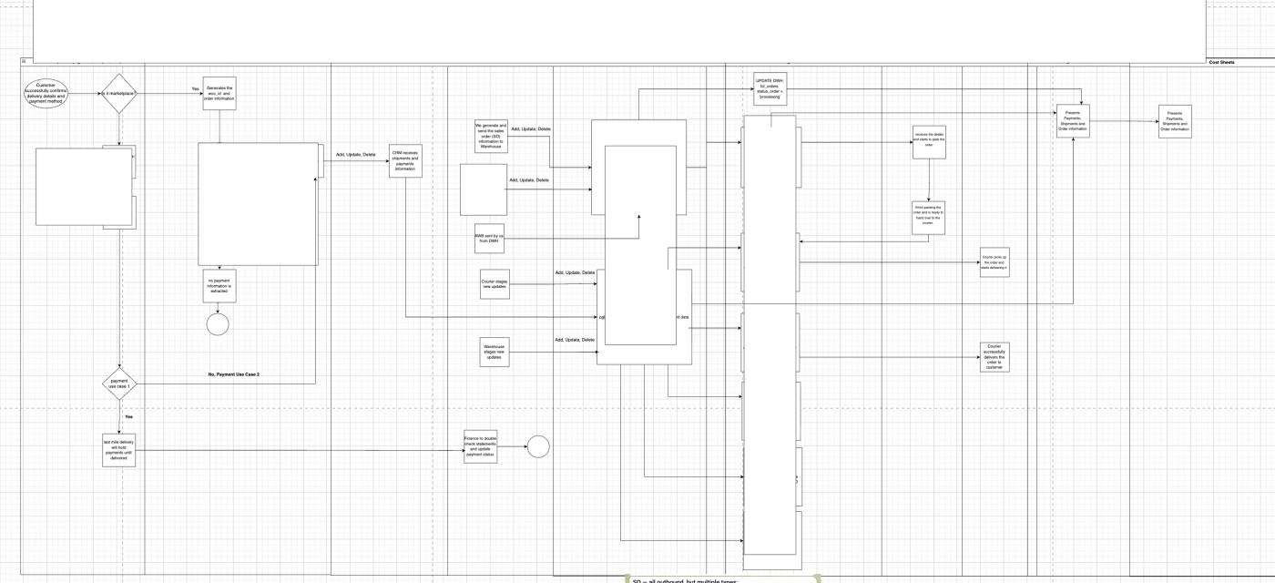
What we built: A massive, multi-lane diagram covering the full data warehouse flow, edge cases, all order types, and a dozen system interactions — none of which the ticket asked for.
What we should have built: A focused diagram of the physical inbound/outbound warehouse flow. That’s it.
The lesson: don’t read a ticket through the lens of what you’re comfortable with. Read it for what it literally says.
Before you draw anything, get answers to these scoping questions:
01
Is this physical warehouse or DWH?
In other words, is it a business flow or a data
flow? Physical warehouse means how goods move on the floor (receiving, picking,
packing, shipping). DWH means how data flows through systems and pipelines. Confirm which lens
is required before you start drawing.
02
What type of diagram is needed?
Is it a UML sequence diagram? A decision tree flowchart? A
pictorial/swimlane diagram? Each has a different structure. Don’t assume — the format affects
how you organise information from the very beginning.
03
What is explicitly out of scope?
Identify what you should not include. For our ticket, this was
warranty flows, return SOs and POs, and anything DWH-related. Knowing the boundaries up front
stops you from building something nobody asked for.
04
What is the objective of this diagram?
The diagram should serve a purpose beyond existing. Ours was to build
enough understanding of how SO and PO worked in the warehouse that the team could answer
questions confidently without asking the bot. That objective should shape every decision about
what goes in.
Ask before you draw — not after. Clarifying scope takes ten minutes. Rebuilding a diagram
that was wrong from the start takes two days. Interns who has gone before you has lost time to the second
option. Don’t repeat it.
The Rules of Diagrams at Vatico
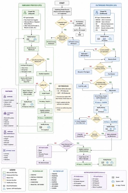
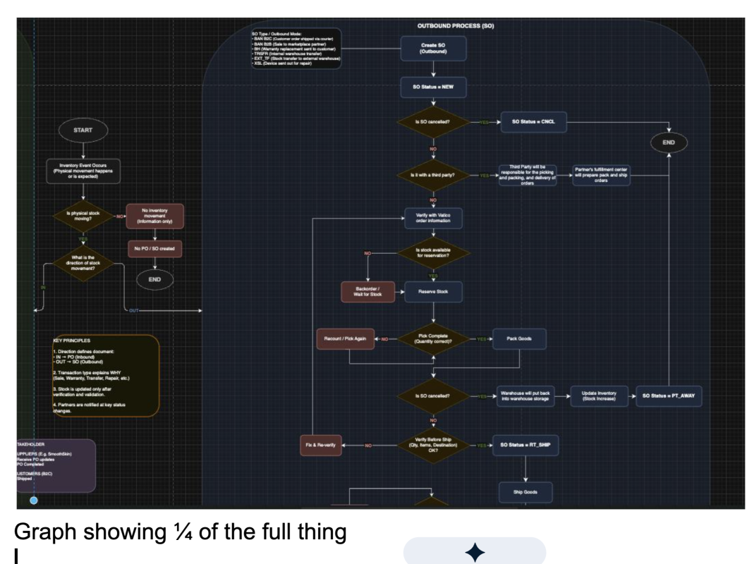
After going through two rounds of revision on our warehouse flowchart, we received a flowchart draft to help us out in the process. It was complicated and elaborate, but what we learnt after is that what is looked for in Vatico is simple and no-brainer.
Keep it Small
Narrow the scope until the diagram fits on a screen without zooming. A small, correct diagram is far more valuable than a large, partially-wrong one. If it’s too big, cut the scope further.
Facts Only
If you are not sure whether something is true, take it out. If you know the general shape but not the details, write it generically. A vague-but-correct label is better than a precise-but-wrong one.
Use Black Boxes
When you don’t know how something works — like which system updates a particular table — label it as a black box or unknown. This is not a weakness; it is honest and prevents misinformation from hardening into fact.
✓
Show only what you need to solve the next task
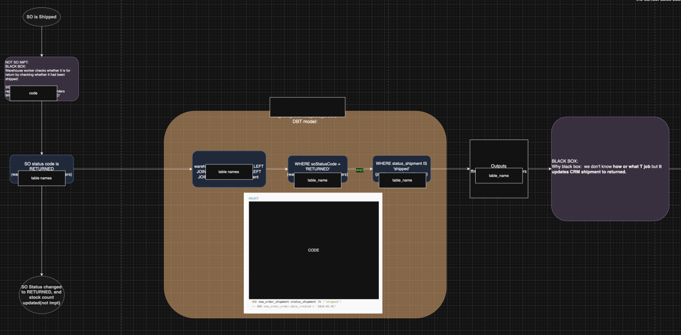
Our final diagram only included the SO return flow because that was all
the subsequent tickets required. We removed the complete decision tree, all the alternate paths,
every edge case. Just what was needed, nothing more.
✓
Denote a clear start state and end state
Every diagram needs an unambiguous input and output. What triggers the
flow? What does “done” look like? Without these anchors, readers won’t know what they’re
supposed to take away from it.
✓
Standardise your terminology throughout
Product, package, and SO are all different things. Pick one term for
each concept and use it consistently across every element in the diagram. Inconsistent
terminology is one of the fastest ways to make a technically-correct diagram unreadable.
✓
Ask, ask, ask — before you fill in the gaps yourself
When something is unclear, the default should be asking your supervisor
— not inferring from how a “normal” warehouse would work. A Vatico-specific warehouse process
may be completely different from the general case, and an assumed node becomes wrong the moment
someone else relies on it.
What an Ideal Vatico Flowchart Looks Like
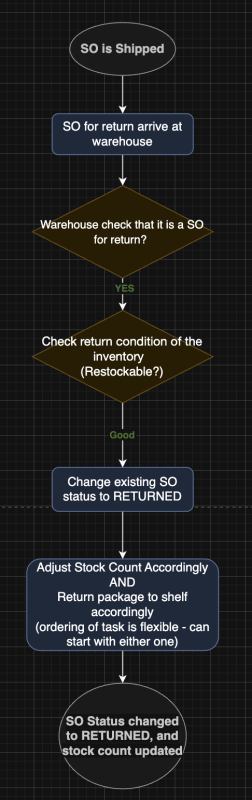
After multiple revisions, we arrived at a version of our flowchart that the team was happy with. Looking at it, the contrast with our first attempt was stark. Here is what made it work:
Anatomy of the final, accepted diagram
Scope: Only the SO return flow — nothing else. Every other part of the warehouse process was cut because it wasn’t needed for the tickets that followed.
Elements: Very few. No sprawling decision trees. No alternate paths that weren’t relevant. One clean path from start to end state, with a single branching decision for restockability.
Uncertain steps: When we didn’t know exactly how the stock count was updated, we wrote “Adjust stock count accordingly and return package to shelf accordingly” — generic but correct. When we didn’t know whether a barcode was scanned on arrival, we took it out entirely.
Black boxes: Anything we weren’t certain about —like whether the package returns via mail or courier — was labelled as a black box to be verified later. This preserved accuracy while keeping the diagram complete enough to be useful.
Reflections on Flowcharts & Diagrams
Scope tight. Facts only. Small and correct beats large and wrong.