Training Data
Common Chart Errors and How to Avoid Them
This write up serves as a guide to some of the common chart errors that rookies are likely to make on their first time performing data visualisation and also how they can be avoided.
Lack of Emphasis in the Chart
Oftentimes, while the information needed is presented in the chart, there is no clear emphasis as to what is the objective of the slide, leading readers confused after seeing the chart. This is usually the result of poor choice of colours that do not make the main point stand out or poor axis size that is too large or too small.
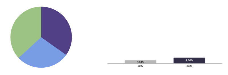
Examples of bad colour and axis (Labels removed for company privacy)
To avoid such errors, we need to think critically about what information is necessary that is the simplest but also provide the necessary emphasis on what the chart is trying to show. In order to do this, we must first understand the objective and purpose of the chart. Then, we will adjust the focus accordingly, such as tweaking colours to emphasise the main point or changing to an appropriate axis.
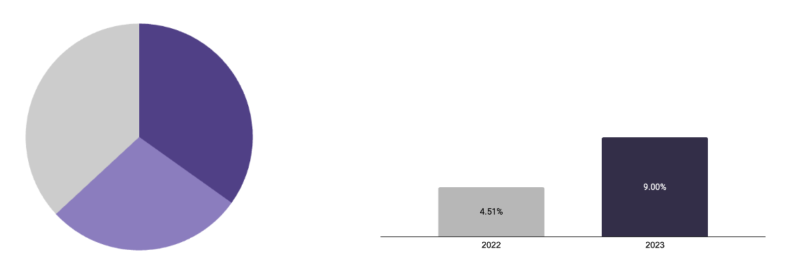
Examples of improved colour and axis (Labels removed for company privacy)
Wrong Type of Chart Used
While all the necessary information may be in place, the type of chart used can still be wrong as there may be information overload that could make the chart not as effective. One example of this would be when stacked bar plots are used. While stacked bar plots provide much more information than bar plots, it is meaningless to show other portions if we are only interested in 1 portion of the stack. Thus there may not actually be a need for the stacked bar plot.
To avoid such mistakes, we must once again understand the objective and purpose of the chart. After doing so, you can then reference the flowchart in the training deck to see which is the best type of chart to be used and proceed accordingly.
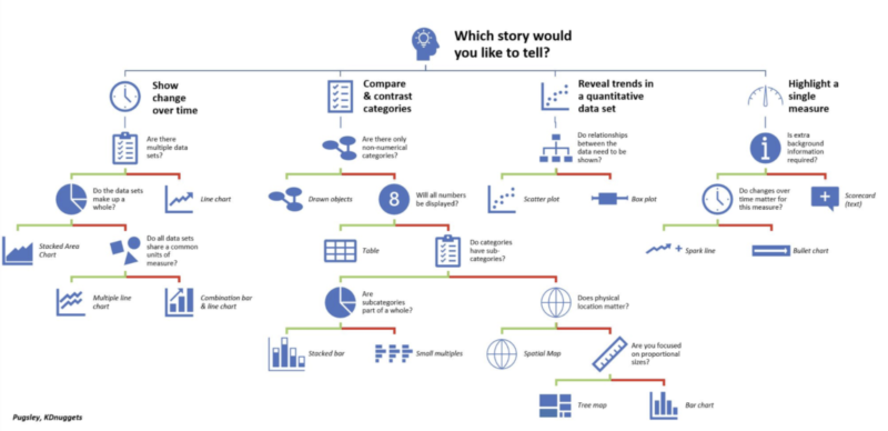
Chart from Training Deck
There will be situations where you will need to use your own discretion to see which chart type is the best. Remember that a complex chart does not mean a better chart if it is not clear.